Easy Read Generator

As the project lead, I designed and tested  the Easy Read Generator, a web application built for the National Democratic Institute (NDI) to transform complex documents into accessible Easy Read formats. This aligns with NDI's business goals in providing all individuals with materials to broaden participation in civic and democratic processes.

SECTOR

Accessibility, Civic Tech, Disability Support, Education

CLIENT

National Democratic Institute

ROLE

Project Lead: User Research, Wireframing, Interactive Prototyping, Interface Design

DATE

Feb - May 2025 (10 weeks)

Key Results
Impact & Overview
By prioritizing accurate representation of user stories, streamlining the generation process, and incorporating clear visual cues to guide users, this platform empowers caretakers assisting those with intellectual disabilities, as well as individuals with low-literacy levels, to simplify complex documentation. This enables more inclusive participation in democratic processes.

The interactive prototype earned an average usability score of 4.0/5. 92% of participants immediately understood the tool’s purpose, affirming the clarity of the landing page and layout. Users described the experience as intuitive, accessible, and easy to navigate with features like image selection and style customization seen as accessible and straightforward.

In response to expensive simplification tools, a Donationware model was introduced. Usability testing revealed it was highly successful, with 93% of participants reporting they would consider donating after using the tool and encountering the donation prompt, reflecting both perceived value and satisfaction. 

A major talking point was other tools being time consuming and overcomplicated. With the Easy Read Generator, users  are now able to complete their task quickly and return to daily activities without friction.

Document generation was intentionally streamlined to just a few steps:


  • Paste text, link, or upload a file
  • Submit for document generation
  • Save and view document
  • Download in desired format with one click
Discovery
A mixed-methods research approach was used to study user behavior with similar tools. Interviews and competitive analysis helped identify key challenges, needs, and gaps in existing solutions.

Individuals with a range of literacy levels were interviewed. Common challenges included unclear language and/or next steps, AI outputs that didn’t reflect user needs, and too many decision points. A strong desire for faster, more tailored results was expressed across the board. 

A competitive analysis was conducted of five similar tools: Easy Read Online, ClaroRead, Scribeeasy, TextHelp, and Microsoft Immersive Reader. It revealed what users found valuable and enjoyable about each, as well as shortcomings they had— especially in processes that required significant time, effort, and payment to use.

Unrepresentative ChatGPT results

Images not culturally relevant for user needs. 
Opportunity:
Separate text and image editing after Easy Read is generated. Use browser location for relevant results.

Existing services are expensive

Features are often locked behind a paywall.  
Opportunity:
Adapt a Donationware model where 5 generations are allowed until account creation is required to continue .

Time consuming processes

Too many steps involved for desired results.
Opportunity:
Reduce number of clicks the user has to make to get their generation tailored and downloaded.

Lack of guidance and instruction

For non-technical users or even one-time users.
Opportunity:
Establish a straightforward user flow with clear language and visual cues to minimize friction.
Personas
Based on market and competitive analysis, alongside structured research, three personas were created that captured technical background, challenges, and motivations of the target audience. 
Solution
The AI powered document simplification process was reimagined through a platform designed to support caretakers of individuals with intellectual disabilities and low literacy.
The core priorities were clarity, ease of use, and step-by-step guidance to more easily change and share these creations.
Information Architecture
These personas guided the user flow, which emphasized rapid, low-effort task completion. I mapped each interaction to ensure clear language, button timing, and the start of planning for the navigation bar.
Wireframes
  • Layout clarity and scan-friendly hierarchy
  • Button placement and visual cues
  • Eliminating dead ends in navigation
  • Refining language for clarity at every step*
Wireframes were created in Figma to test and refine:


These ideas represent the first two iterations. They gave us a good starting point for feedback.
Iteration
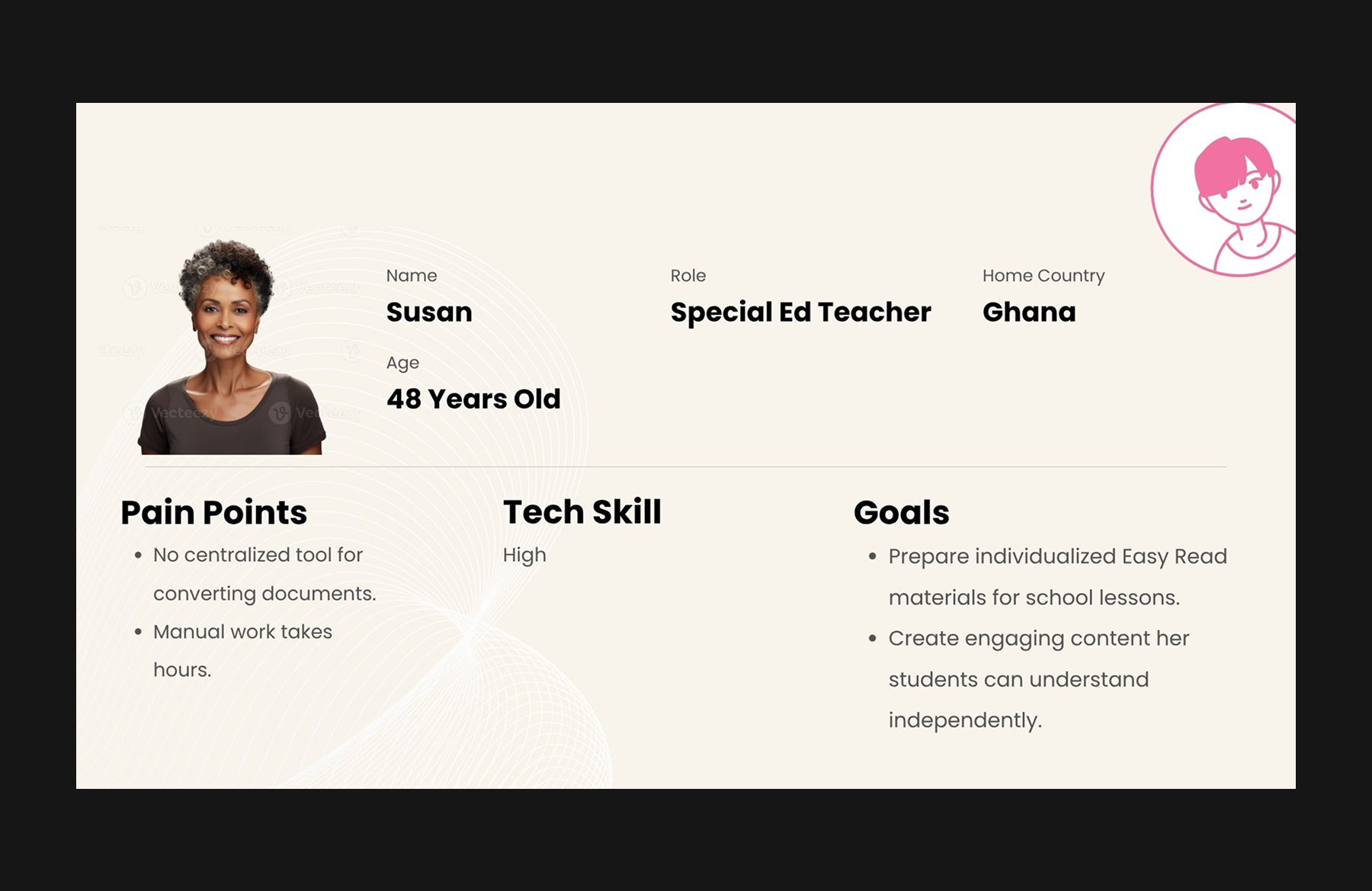
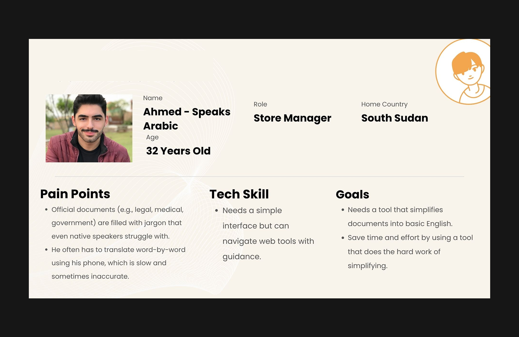
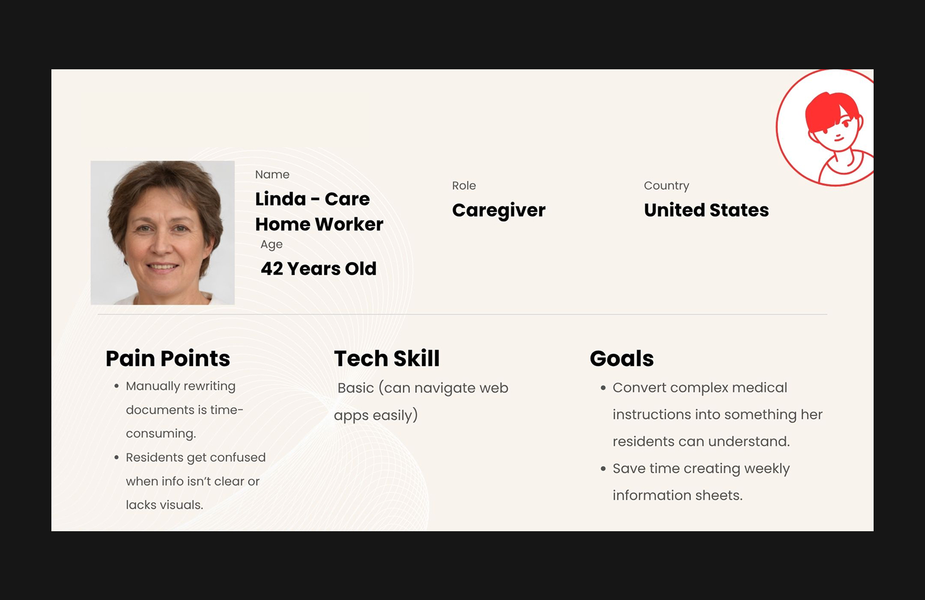
I facilitated biweekly design reviews with the client, adopting an agile workflow across the 10-week project. Each meeting involved presenting design decisions, reviewing feedback, and collaboratively adjusting features.

LANDING PAGE
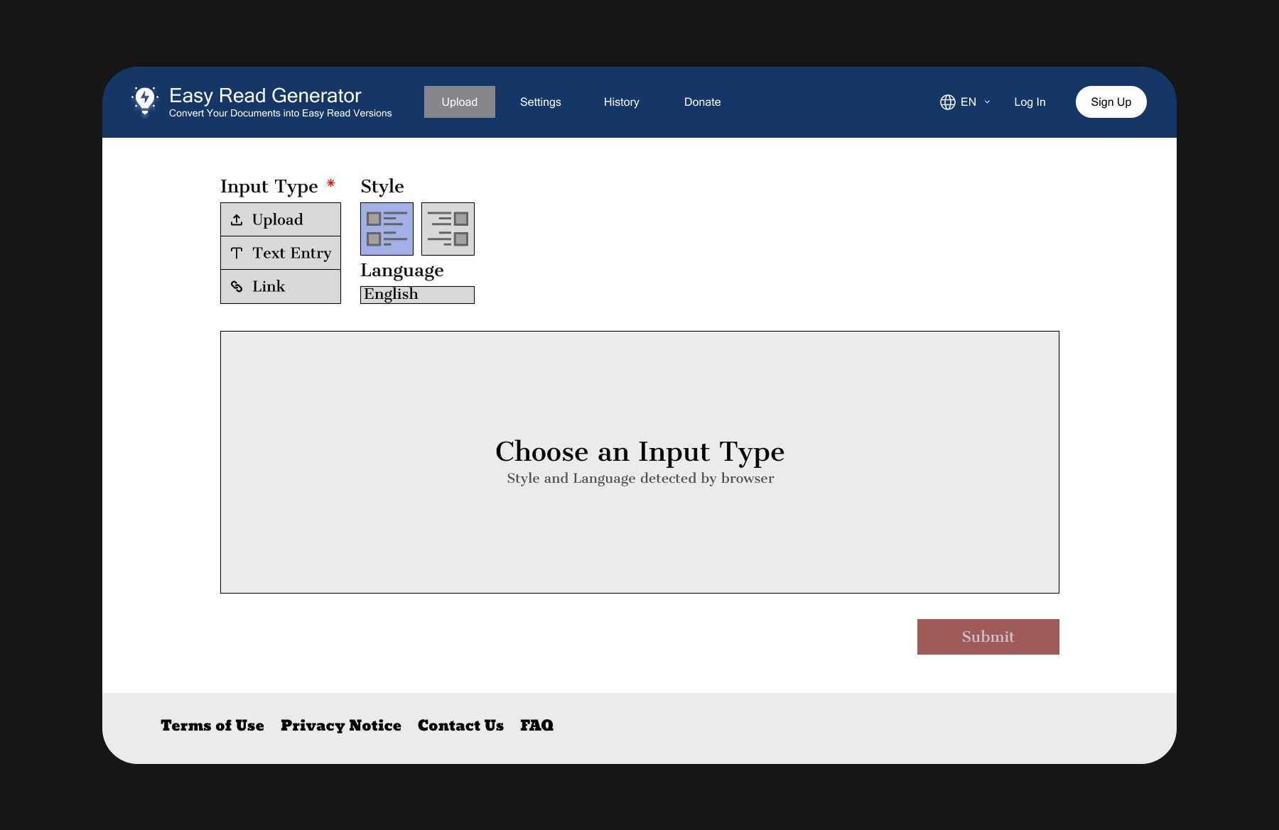
The original landing page included a closable Document History window, which cluttered the interface and conflicted with the tool’s one-time use focus. It was later removed to optimize the experience. The final design presents only relevant Input Type (uploading files, pasting text, or entering links). Language and Style now auto-detected by the browser. These changes reduce cognitive load and ensure the tool’s purpose remains clear and intuitive.
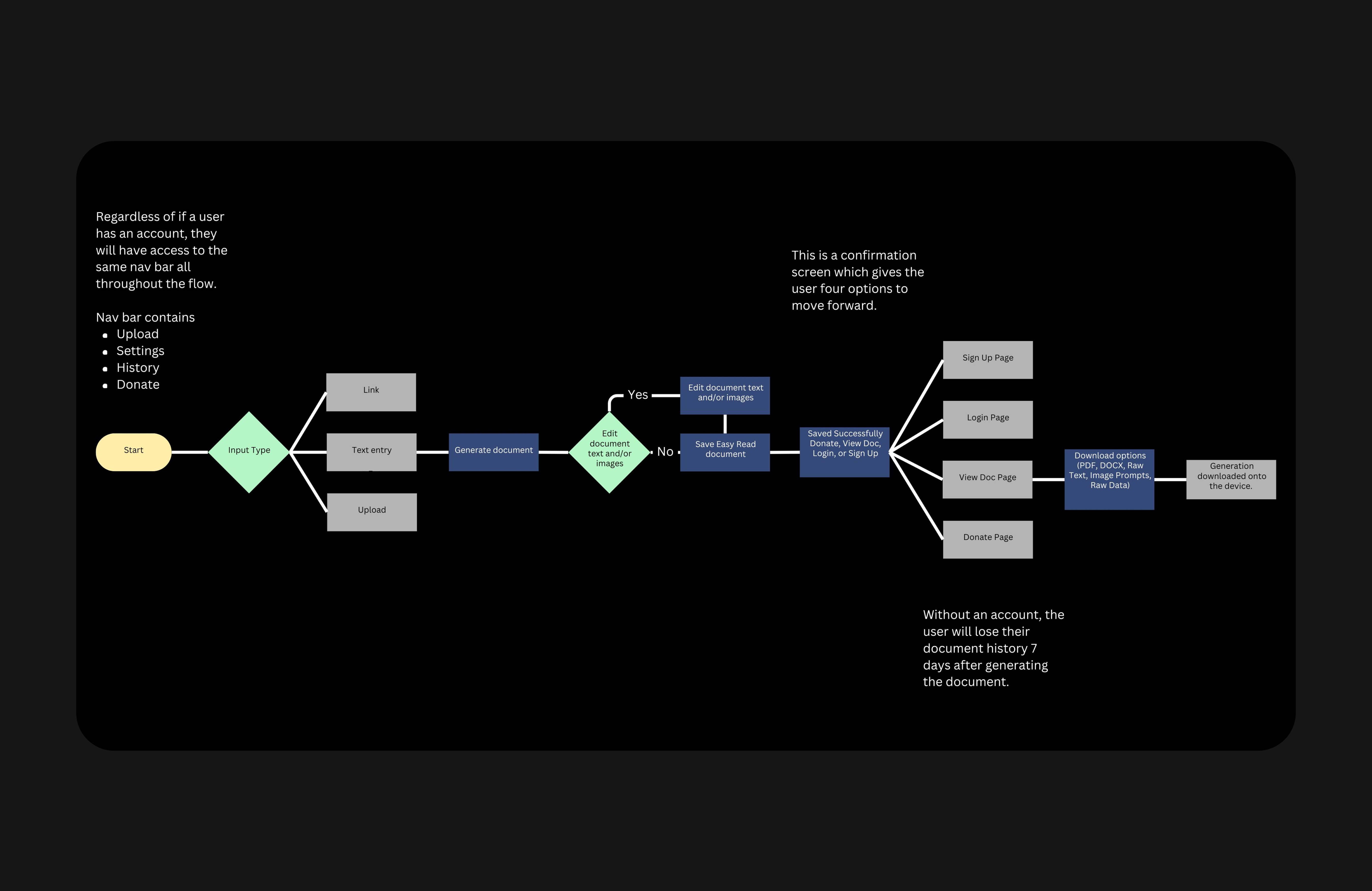
FLOW AND NAVIGATION
The original user flow had the Login or Sign Up screens first, with no access to the Upload tab while on these pages. Not wanting to create barriers so early on in the process, the navigation bar and the user flow were reworked for the final iteration  The user now starts on the Upload tab for speedy task completion. Even when on the Login / Sign Up pages, the navigation bar now stays the same. Further, it stays consistent for users with or without an account. History and Settings are now tailored to users depending on this State.

BUTTONS
Originally, a “Discard Changes” button was placed beside “Save” in the document editing canvas. However, testing revealed it caused confusion and introduced unnecessary complexity, so it was removed.

LANGUAGE
The “Close” button on the “Saved Successfully” screen was renamed to “View Document” to guide users more clearly to the next step, which is accessing their generated file. In the document editing canvas, language was further refined to better support prompt engineering. “Edit Image Prompt” replaced the vague label “Suggested” to make it clearer how users could revise their generated images.

These refinements emerged through iterative testing and close collaboration with the client.
Next Steps
  • Add a short demo video on first use (preferred over tooltips since clicks would be minimal)
  • Include a text-to-speech feature for increased accessibility
  • Add a visual progress bar to reduce uncertainty during generation
  • Images within the app interface (and not generated) could better engage users with the tool. 
We closed with four key recommendations:


These refinements would build on the prototype’s success and further support users with varying literacy or tech familiarity. Future testing should confirm the validity and intuitiveness of these additions.