Learnable

LearnAble addresses barriers students with dyslexia face in remote learning, including inconsistent layouts, poor readability (font size, styles, colors), and lack of integrated assistive technologies. Through contextual inquiry, personal development, and user testing, an accessible, customizable platform was created to reduce cognitive load and enhance learning experiences.

SECTOR

Education Technology, Assistive Technology, Accessibility

ROLE

User Research, Wireframing, Interactive Prototyping (Lead),  Usability Testing

DATE

Sep - Dec 2024 (10 weeks)

Key Results
Impact & Overview
Framed as a "digital library," the interface presents information in a logical structure that encourages exploration and supports an inclusive learning atmosphere. The design embraces an ecological perspective, recognizing that students' learning experiences are shaped by their broader digital environment. 

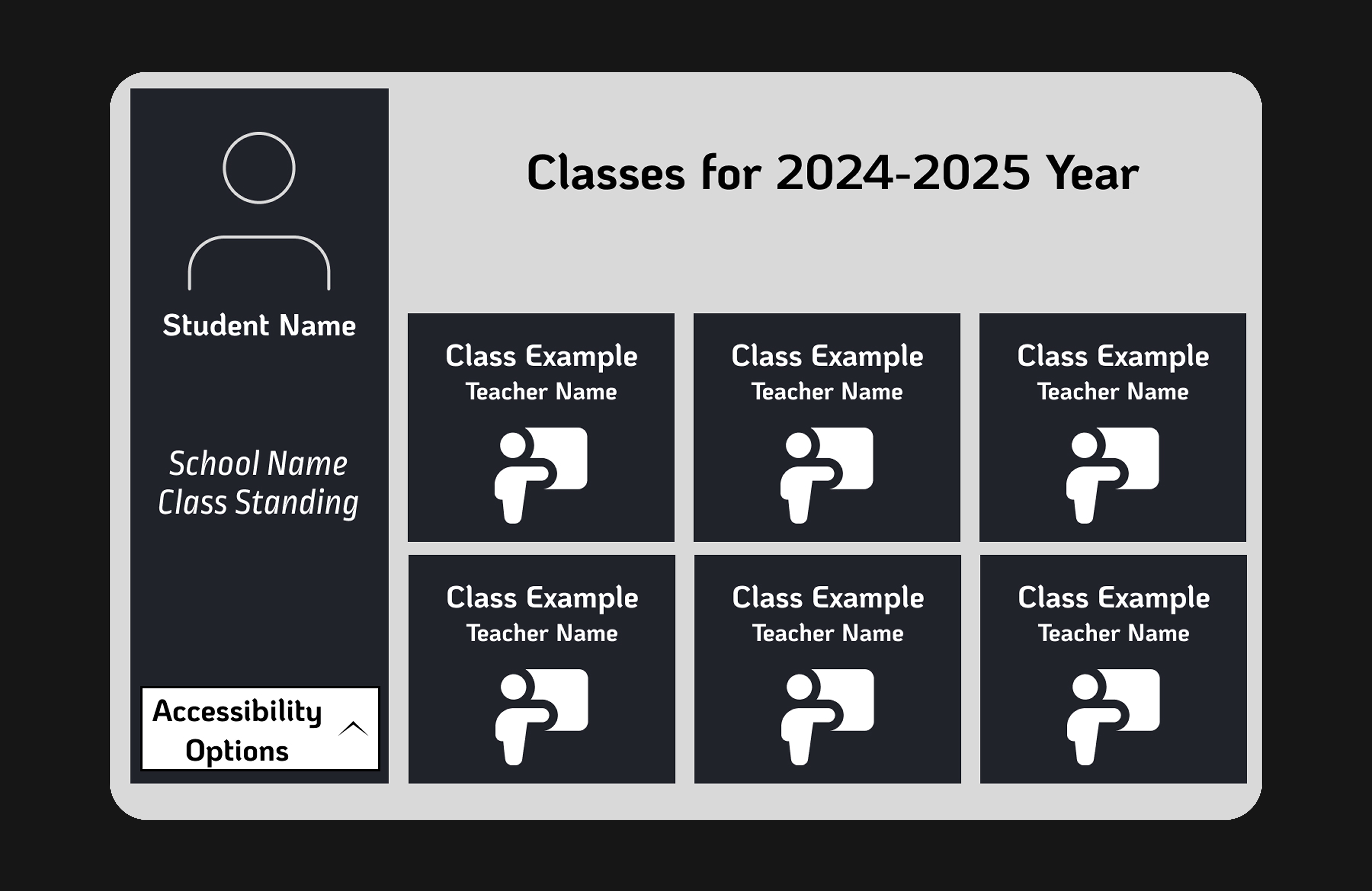
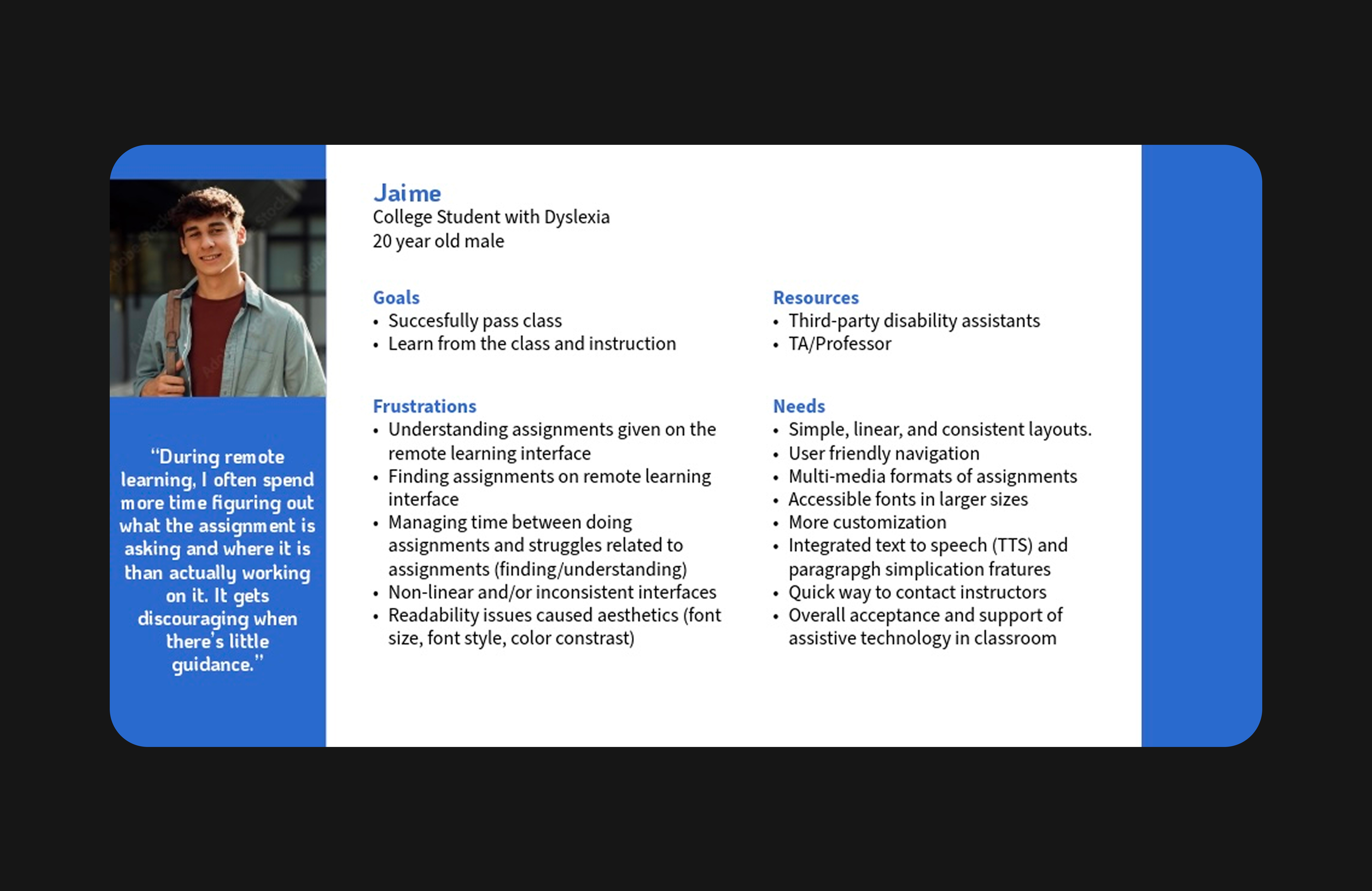
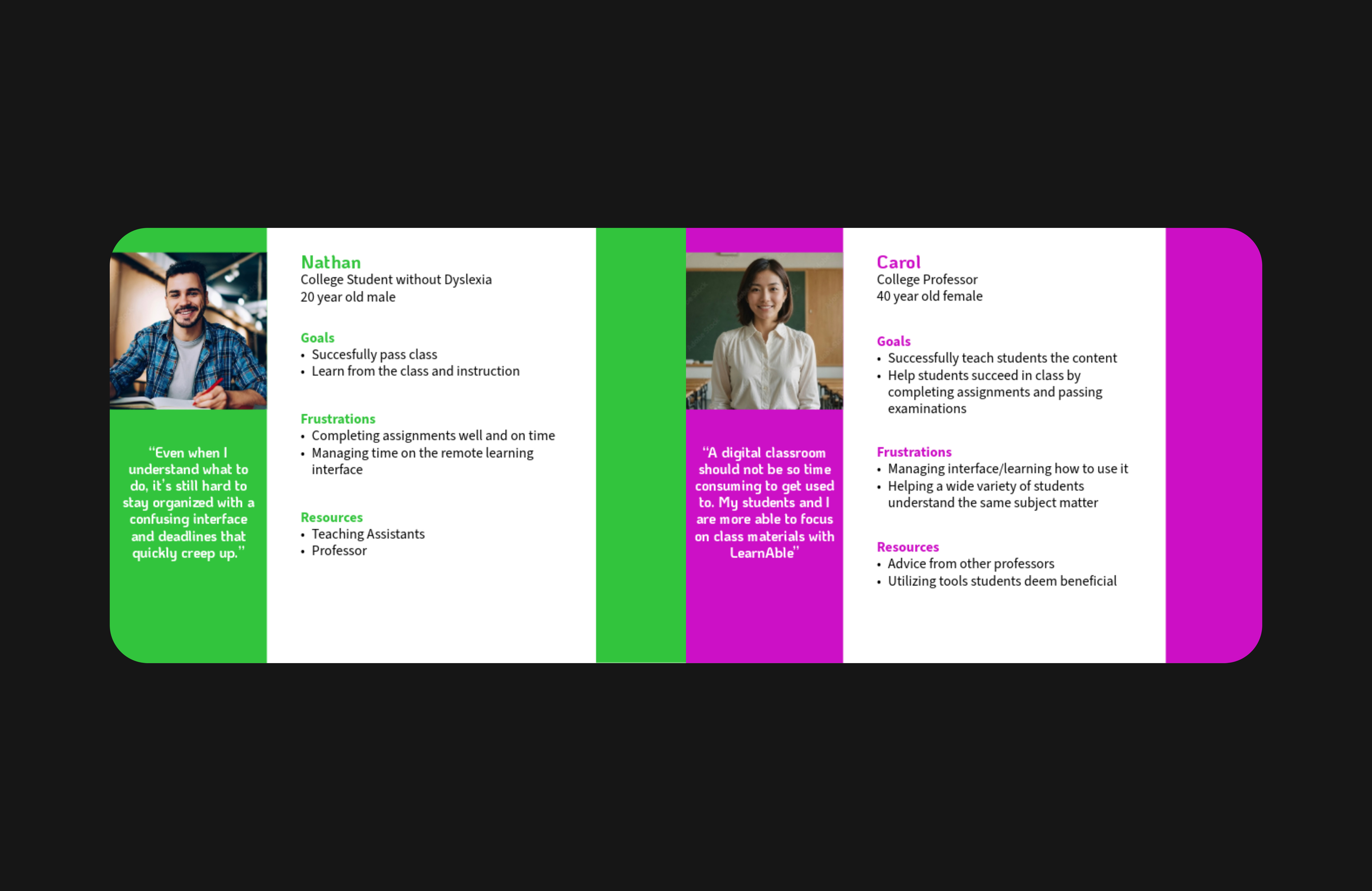
Features such as simplified layouts, dyslexia-friendly fonts, embedded assistive technologies, multimedia content, and built-in instructor contact options were incorporated into the final iteration. It was consistently rated as clean, visually organized, and easy to navigate. All users found the layout intuitive and uncluttered, enabling efficient task completion.There were no issues locating assignments, information about instructors, AT tools, or settings to change the interface.

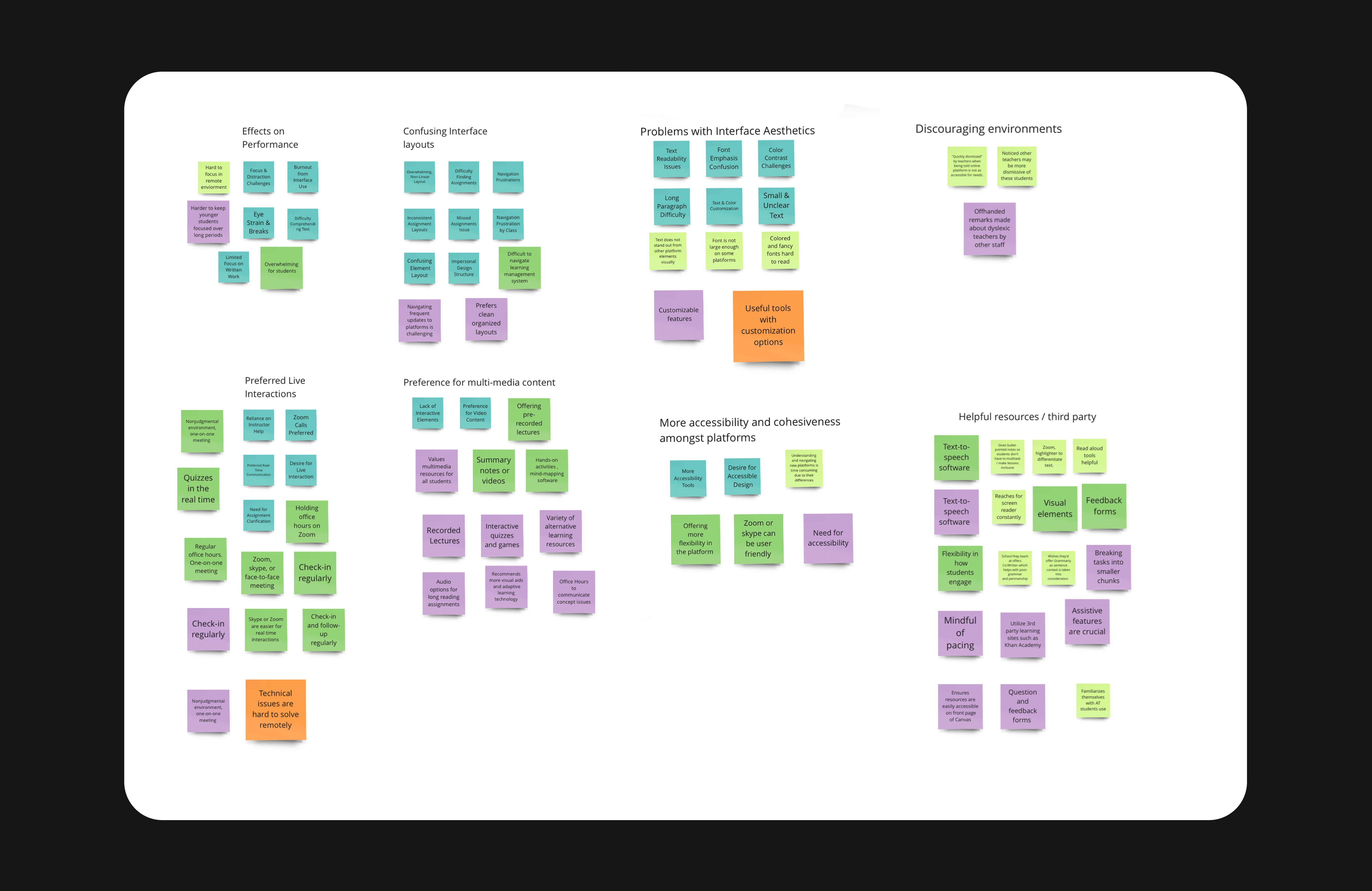
Adaptive layouts allowed for font and contrast adjustments, where some users reported difficulties with font type and spacing in longer texts. This highlights the need for further development in readability options.

Despite strong usability ratings, individual experiences varied slightly, emphasizing the importance of adaptable design that can accommodate a range of individual needs. 
Discovery
To improve remote learning for students with dyslexia, it is important to consider the perspectives of three key groups: students, teachers, and parents or guardians. Students with dyslexia in remote learning programs are the primary users this platform aims to support. Their experiences, challenges, and preferences are central to our work. Engaging directly with these students will ensure that the solutions we design are grounded in their real needs. Teachers will also be interviewed, as they offer critical insights into instructional barriers and remote teaching challenges.

While parents and guardians play an important role in supporting learning at home, they will not be directly interviewed, as our user group consists of older students who manage much of their learning independently. Engaging students and instructors ensures our solutions resonate with the target audience. 
Interviews
Five students, four instructors, and three teaching assistants (TAs) were interviewed to gain more insight. Students 16-21 years old were selected to align with LearnAble's target population of high school and college students. TAs and instructors also teach at this level. 

Of the five students interviewed, four had been diagnosed with dyslexia, while one was not. This allowed for meaningful comparison. 

Students with dyslexia faced the same interface-related challenges as their peers with clutter, difficulty concentrating due to non-linear navigation, and lack of real-time instructor interaction. However, these issues had a much greater impact on their daily learning timelines. While non-dyslexic students described these as manageable disruptions, students with dyslexia experienced them as significant barriers that slowed their progress by days. They also reported added struggles with readability due to poor aesthetic design in assignments, turning minor setbacks into ongoing obstacles.
Affinity Mapping
Interview notes were synthesized through affinity mapping on Miro, allowing us to identify recurring themes and user concerns. The process surfaced eight key themes:

These themes and considerations informed key design decisions across the LearnAble platform.
  • Effects on Performance
  • Confusing Interface Layouts
  • Problems with Interface Aesthetics
  • Discouraging Environments
  • Preference for Live Interactions
  • Preference for Multi-Media Content
  • Desire for Cohesive, Accessible Platforms
  • Need for Third-Party Tools and Support

Multimedia formats over text

Text heavy materials cause a lot of burden to students with dyslexia.
Opportunity:
Integrate multiple content formats natively (e.g., video, audio, interactive activities).

Assistive tech awareness is low

Students don't know built-in TTS/STT exist when using other devices.
Opportunity:
Embed assistive technology options into assignments for students to see and utilize. 

Lack of instructor support

Without real time feedback, students face this barrier to ask for help.  
Opportunity:
Provide built-in educator support. Clearly embed buttons to tools such as Zoom and email.

Interface design causes cognitive overload

Layouts, colors, fonts.
Opportunity:
Design clean, customizable interfaces with linear navigation flow and accessible typography.
Using qualitative and quantitative data collected from interviews, I developed three personas to better empathize with both primary and secondary users. Jaime (20, Student with Dyslexia) represents LearnAble’s primary audience. However, the interface layouts and aesthetics are also designed to benefit users like Nathan (20, Student without Dyslexia) and Carol (40, Instructor). 
Personas
Solution
We reimagined the remote learning experience through a platform to better meet the needs of dyslexic students. The main focuses were on readability, simplicity, and real-time support.
This storyboard showcases Jaime (student with dyslexia) struggling with the default interface. Through customizability, he is able to change the interface to meet his needs through fonts, display, and sorting options to successfully complete the assignments.
Interactive Prototyping
A series of wireframes were crafted to illustrate key screens a user encounters, and what triggers (user actions) allow them to navigate through the LearnAble platform.

From logging in to accessing specific courses and assignments, every part of the flow was designed with clarity and ease in mind. Key screens included clearly marked Accessible Options buttons, ensuring that users could quickly adjust the interface to suit their needs. This foundation made it possible to build a final product where users could easily locate essential information and customize their experience without frustration.
Interaction Design Flow Chart
Final Design: Interactive Prototype
Below is the high fidelity, fully clickable and interactive prototype of the LearnAble platform. I designed the entire platform in Figma.

The high-fidelity prototype introduces:


  • A clear, linear interface without a cluttered navigation bar, aligning with user preferences.
  • A white Accessibility Options button on the homepage to reveal settings like card or list view, light or dark mode, and adjustable font size. Changes are applied only after clicking "Save," helping prevent sensory overload while exploring. Preferences remain consistent across sessions and screens. 
  • Course pages that clearly separate class content from instructor information, with direct options to message, email, or join Zoom meetings. There's also a black Accessibility Options button with the same options, plus a filter to sort assignments by Due Date or Published Date.
  • Each assignment includes embedded accessibility tools such as color themes, alternative formats, and text-to-speech
Conclusion
  • Implement user-controlled customization: font size, layout density, color schemes
  • Conduct A/B testing on font types preferred by users with dyslexia
  • Run targeted usability sessions with students who have dyslexia
  • Add qualitative methods (e.g. focus groups) to further capture emotional and motivational insights.
While usability testing revealed current LearnAble prototype is structurally sound and visually accessible, true inclusivity requires more than a functional interface. The consistently positive feedback on navigation validates our structural design decisions and confirms that users were able to move through the interface with ease. However, this consistency in flow contrasts with the variability in user needs and preferences when it comes to readability and visual comfort.

A one-size-fits-all approach is insufficient. Even when a design is accessible, it may still fall short for individuals with visual sensitivities or cognitive differences. Clean, uncluttered spaces helped reduce cognitive load, while areas perceived as overwhelming or visually dense detracted from user comfort and focus.

In future iterations, the platform must: